This was definitely a big and very fun project to work on for my repeat client Convirtue.com, It involved many challenges and some serious problem-solving skills. My client wanted to completely revamp the Blog side of their Affiliate Marketplace, their online store has a big blog component to it, but it felt like it had the bare minimum; very little customization, user interactivity, poor performance, and a number of other issues. Check out the video below where I highlight some details...
Video Tour
As I mention in the video, the number of changes were many,
and the number of challenges, even more. That made this
project particularly fun for me. I dove deep into the PHP
server code and wrote some custom functions that would allow
for a grouping of the posts into 5 different categories:
and an "ALL" category which would be the base Blog page, and
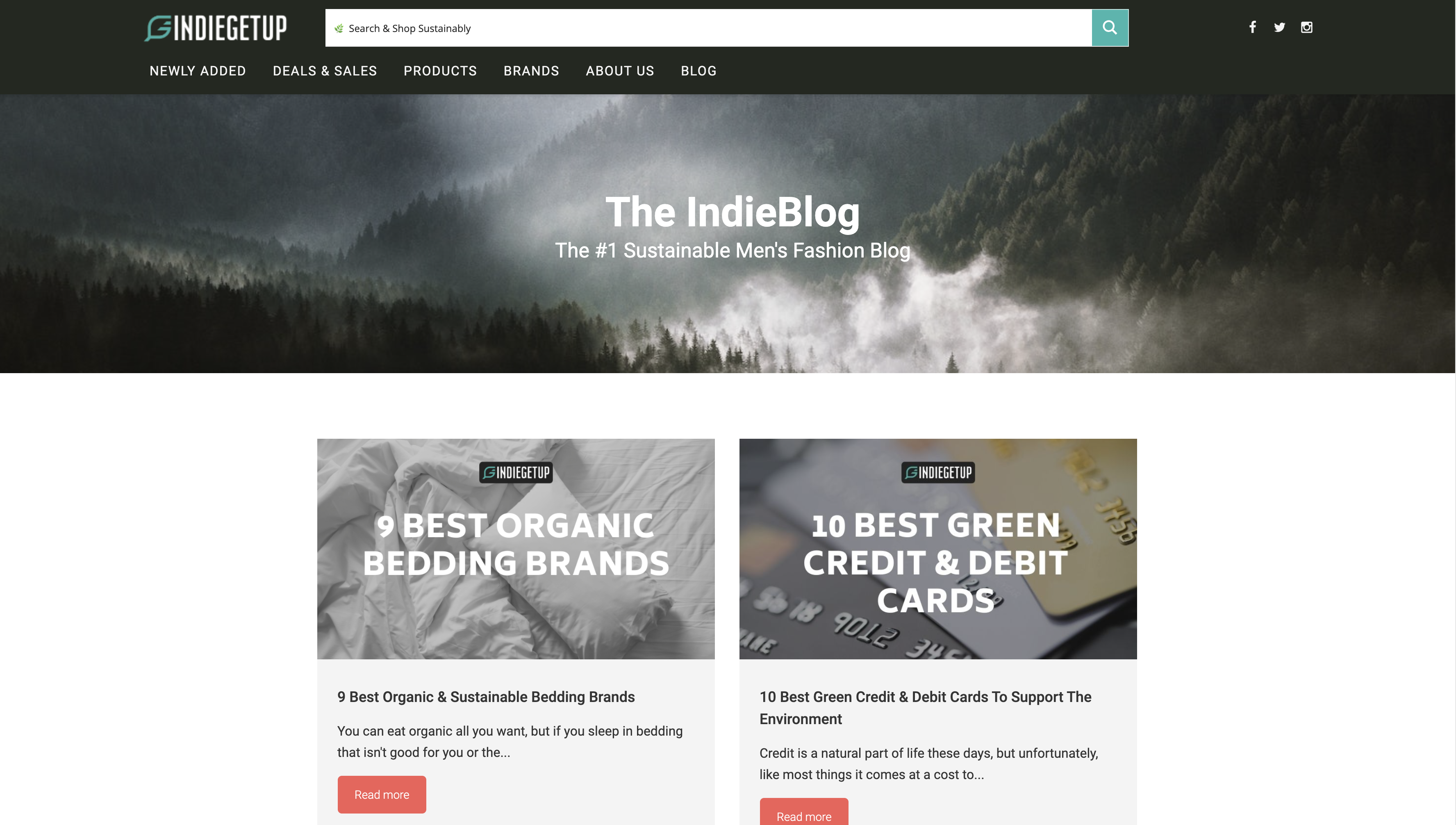
it displays all the posts on the website. This is what
the Blog page used to look like:
 After I finished with the custom PHP server code, I tackled
the redesign. There were three major changes to this
template in particular:
After I finished with the custom PHP server code, I tackled
the redesign. There were three major changes to this
template in particular:
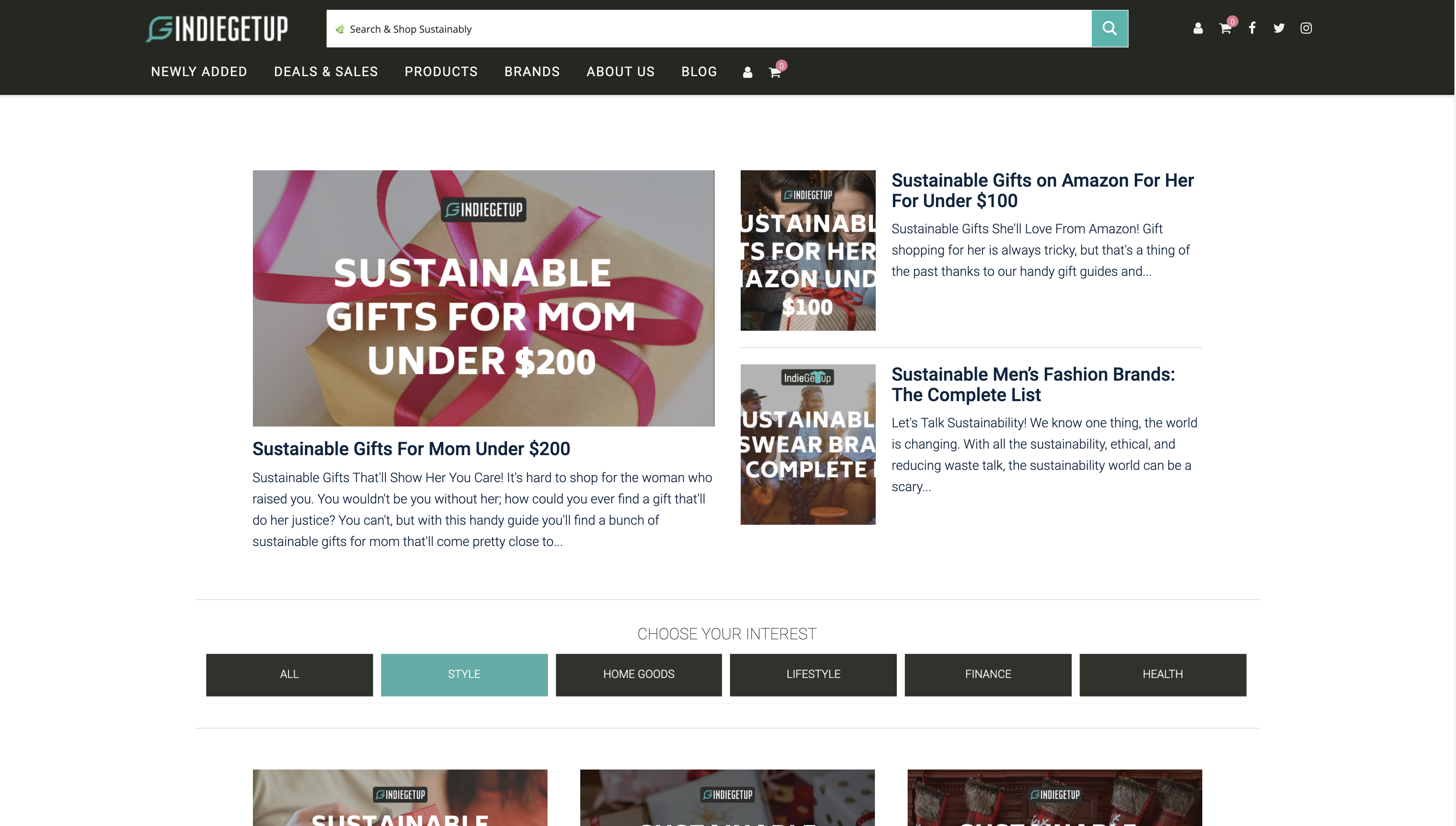
- The 3 most recent posts had to be presented separated from
the rest and in a different layout.
- The addition of a new
section containing links to the different blog categories.
- And to change the older posts from a 2 column grid, into a
mobile responsive 3 column grid.
The first task presented two challenges: "What if a category
has 3 or fewer posts?"
To tackle this, I wrote a custom PHP function that would
display the new layout that makes the 3 most recent posts
only if there are at least 4 in that category:
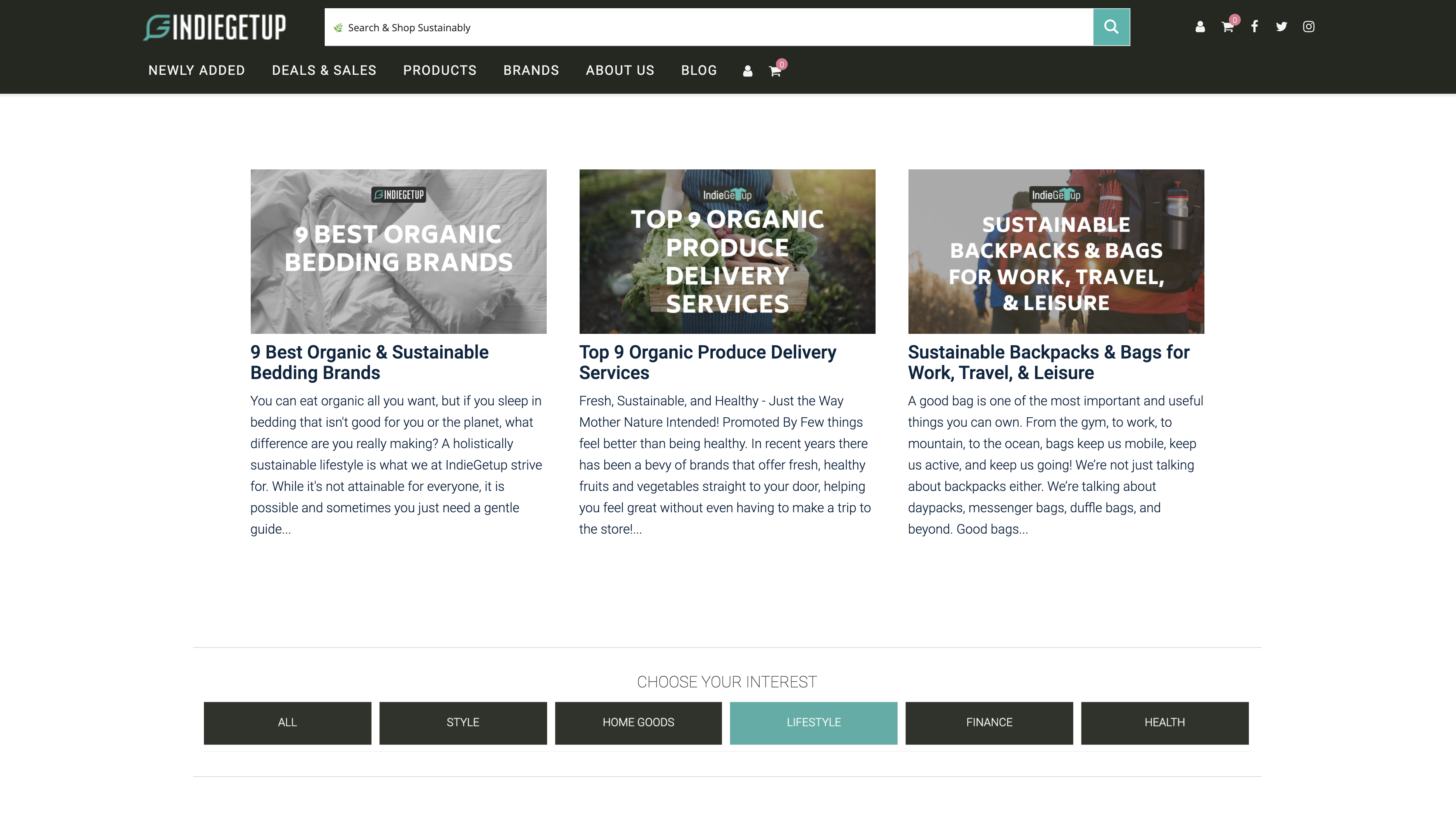
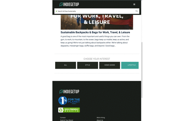
As you can see, the new template only shows for the 'Style'
category Page as it has a lot more than 3 posts, whereas the
'Lifestyle' category Page, which only contains 3 posts, simply
displays them in a 3 column grid. Notice also how, thanks to
some custom CSS and JavaScript, the currently visited category
has its corresponding button highlighted.
And the other challenge with this part came in the form of one of the
most well known WordPress limitations: the excerpt length.
WordPress has a limit of 55 words for post excerpts by default,
and this is a very hard thing to modify. The problem is that
my client wanted the latest post to have an excerpt of a different
length than the rest. To go around this, I had to come up with a
whole WordPress plugin. This allowed me to set 3 different
categories of excerpts based on their amount of words, and then
dynamically assign each post preview with its corresponding
category based on the amount of words it should have.
Another big challenge I faced during this project, came when I realized that the previous Blog Page behavior yielded some really poor performance. That's because it forced the page to load all the posts from the database at once before it would display anything on the browser, making visitors see a black screen for a couple of seconds. Needless to say, this had to be improved! I then wrote some custom AJAX calls like I explain in the video to enable an Infinite Loading effect. Basically, it allows the page to preload a few posts, render the page on the browser a lot quicker, and as a visitor scrolls down the page, more and more posts get loaded. This minor change granted a 60% speed optimization!!
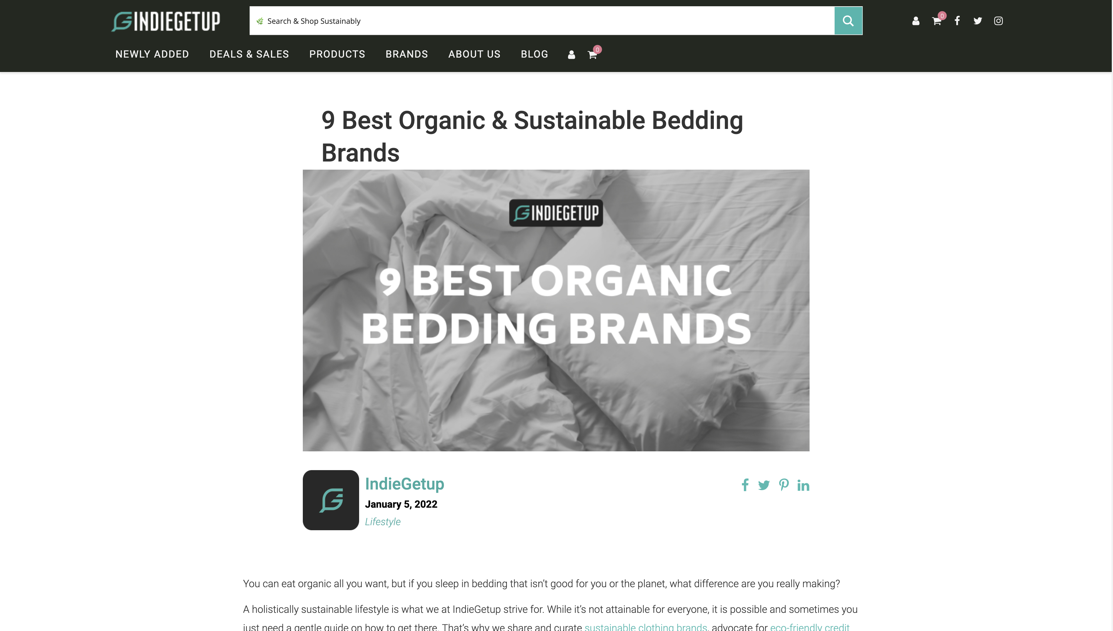
For the Single Post Page, the changes weren't so many. I basically just wrote some basic HTML, CSS and JavaScript to show a better Post Image, reposition the social sharing buttons to a more accessible place on the page, and added the Post Category link to the post. This is what the new Post template looks like:
Lastly, another challenge was how to handle mobile responsiveness, especially for the Post Category buttons. My initial approach was to use a Flex container, which would basically wrap the buttons into one column once the browser window got small enough. However, I notice how this approach would take a lot of real estate away from the important content, so I came up with a different approach. I wrote some custom JavaScript and CSS and made the buttons hide when overflown and enable the visitor to scroll left and right on them, as you can see right below:
This project was definitely a fun challenge for me, as well as a pleasure since I got to work again with a great client! I tried listing as many details as I could here but feel free to visit their blog to explore around and see for yourself the new and improved version of this website that I had the honor to help with.